Mastering Responsive Menu Design in Framer
In this article, we will provide a comprehensive walkthrough on how to design a responsive menu in Framer. By focusing on responsive menu design in Framer, you will learn how to create adaptive navigation that works seamlessly across all devices, including mobile, tablet, and desktop. We will explore various breakpoints and ensure that your navigation remains intuitive and user-friendly at every screen size.
Designing a Responsive Menu in Framer
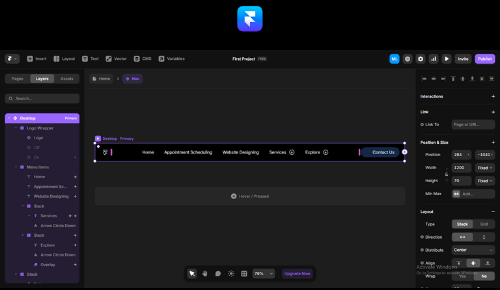
Responsive menu design in Framer plays a vital role in delivering smooth navigation across all devices. To begin, set up clear breakpoints for desktop, tablet, and mobile screens. This step ensures the menu layout automatically adapts to every screen size.
Next, design the header section within the desktop breakpoint. Group all elements—such as the logo, navigation links, and buttons—inside a stack. As a result, these components remain properly aligned and fully responsive when the viewport width changes.
Moreover, apply a fill-width setting to every section within the header. This approach allows the elements to resize smoothly and maintain a consistent layout on different screens. Because of this, your Framer responsive navigation design will stay functional and visually balanced.
After completing the desktop version, convert the header into a reusable component. Then, adjust this component for both tablet and mobile breakpoints. Consequently, your responsive navbar design in Framer will stay consistent and easy to use across all devices.
Optimizing a Responsive Menu in Framer with Reusable Components
After setting up the initial structure of your responsive menu — including the header elements, menu items, and buttons — the next step is to focus on optimization. The key to successful responsive menu design in Framer is building a reusable component that can adapt across all devices. This approach ensures a mobile-friendly menu in Framer while maintaining consistency and performance.
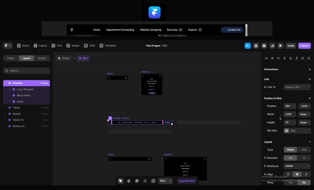
1. Building a Reusable Menu Component
Start by designing a single menu component that contains all essential navigation elements. This base component should be flexible and structured, allowing you to quickly create variants for different breakpoints. Because of this, you can manage design updates in one place and maintain uniformity across the entire site.
2. Creating Variants for Different Breakpoints
Once the core component is ready, create three variants — one each for desktop, tablet, and mobile. Each variant should adapt to its specific screen size and behavior.
Desktop Variant: Focus on a full navigation layout with visible links, a contact button, and clear spacing. The menu should expand naturally across the header.
Tablet Variant: Simplify the layout while keeping essential navigation elements accessible. Use a collapsible or partially hidden menu to save space without compromising usability.
Mobile Variant: Prioritize a compact, mobile-friendly menu in Framer with a hamburger icon or toggle button. The design should ensure smooth open and close behavior and quick access to all links.
3. Adaptive Layout and Interaction
Each variant must adjust not only its layout but also its interaction style. For example, hover effects work well on desktops, while tap or swipe interactions suit mobile devices better. By tailoring these behaviors, you create an adaptive menu design for all screen sizes that feels natural on every device.
4. Best Practices for Switching Between Variants
Use Framer’s built-in breakpoint logic to automatically switch between variants based on screen size. Additionally, test transitions thoroughly to ensure smooth animations and responsive performance. Managing the open and close behavior for each breakpoint is equally important — desktop menus often stay visible, whereas mobile menus should slide in or overlay seamlessly.
Final Thoughts
By creating a reusable component and defining well-structured variants, you optimize your responsive menu design in Framer for performance, usability, and scalability. As a result, your site delivers a consistent, adaptive menu design for all screen sizes and a seamless user experience across every device.
Building Dynamic Menu Variants in Framer
After creating responsive menu components and their variants, the next crucial step in responsive menu design in Framer is transforming those variants into fully dynamic menus. A dynamic approach enhances navigation and makes the interface more engaging, resulting in a seamless user experience across all devices. Moreover, it helps you deliver an adaptive menu design for all screen sizes that feels intuitive and visually appealing.
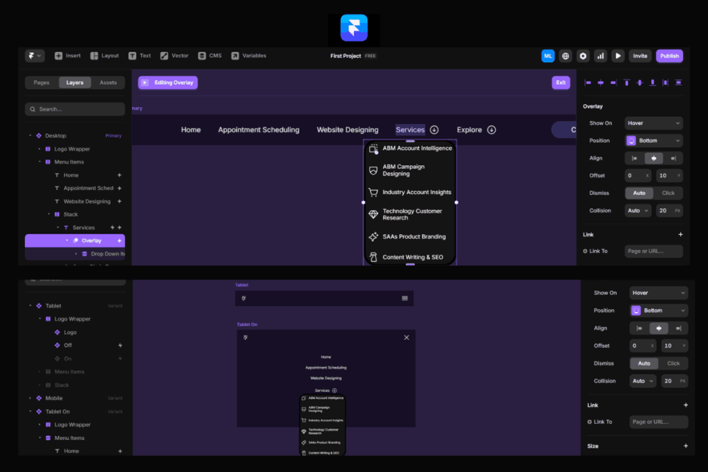
1. Adding Interactivity to Menu Variants
Start by implementing interactive features that bring your menu to life. Include hover effects for desktop users to provide visual feedback and improve navigation clarity. Additionally, integrate dropdown overlays that display extra links or categories when users interact with specific menu items. These overlays should load smoothly and remain responsive, ensuring that the mobile-friendly menu in Framer feels just as polished as the desktop version.
Nested menu items also add depth to your navigation. They allow you to organize additional services, product categories, or company information without overwhelming the main menu. Because of this structured approach, users can easily explore deeper layers of content without confusion.
2. Setting Up Overlays Across All Breakpoints
To ensure smooth functionality, design overlays that adapt to each breakpoint — desktop, tablet, and mobile. On desktop, dropdowns should appear near the parent menu item and respond instantly to hover actions. On tablets, consider using tap-based triggers with subtle animations for better interaction. For mobile devices, overlays should slide in or expand vertically, creating a mobile-friendly menu in Framer that feels natural and easy to navigate.
3. Best Practices for Dynamic Menus
Maintaining consistency is essential when adding richer navigation layers. Use uniform colors, typography, and motion patterns across all variants to reinforce a cohesive design. Additionally, always prioritize usability — interactive features should enhance the user experience, not complicate it. Keep transitions smooth, ensure text remains readable, and optimize touch targets for smaller screens.
Finally, test your menu thoroughly on multiple devices and screen sizes. This step ensures that your responsive menu design in Framer behaves reliably and that your adaptive menu design for all screen sizes remains both functional and visually appealing.
Final Thoughts
By adding hover effects, dropdown overlays, and nested items, you transform a static navigation bar into a powerful and interactive menu. These enhancements not only improve usability but also strengthen engagement, allowing your users to explore content effortlessly across all devices.
Discover Framer Menu Design Expertise
Freelancer Rajat Adhikari specializes in responsive menu design in Framer, focusing on creating adaptive menu designs for all screen sizes. His approach ensures that menus remain user-friendly and visually appealing across desktop, tablet, and mobile devices.
Rajat integrates features like hover effects, dropdown overlays, and nested items to enhance the navigation experience. This ensures a mobile-friendly menu in Framer that adapts seamlessly to different screen sizes.
For those interested in Framer website development, Rajat offers comprehensive services for various types of websites, including e-commerce, SaaS products, and industry-specific platforms.
Contact Freelancer Rajat Adhikari to explore how his Framer expertise can benefit your project.